How I AI: A Designer's Guide to Cursor with Elizabeth Lin – From Y2K Aesthetics to Interactive Pianos
Learn how designers can use Cursor for creative exploration, not just coding. In this episode, design educator Elizabeth Lin shows us how to generate visual styles, build an interactive piano with sound, and transform an ugly dashboard into a polished interface.
Claire Vo
I was so excited for this episode because we're talking about a tool that many people think is just for software engineers: Cursor. But my guest, Elizabeth Lin, is a designer who uses it as her creative partner. She's showing a whole new way for designers to think about and use code-based AI tools.
Elizabeth is an independent design educator who has built courses and programs for places like Khan Academy and Lambda School. She now runs design is a party, where she teaches some really cool courses like Prototyping with Cursor. She brings a sense of play and experimentation to her work that I find incredibly inspiring, reminding me of the early, chaotic days of the internet on platforms like Neopets.
In our conversation, Elizabeth breaks down three distinct workflows that any designer can use to speed up their process and get more creative. First, she shows how she uses Cursor as an inspiration engine to explore different visual aesthetics for a simple webpage. Then, she does something I thought was amazing: she builds a fully functional, interactive piano with sound using just a single prompt. Finally, we tackle a common design challenge: taking a genuinely ugly, AI-generated dashboard and iteratively refining it into something polished and professional. These workflows really show how AI can act as a collaborator, giving us new abilities for creativity, interactivity, and rapid prototyping.
Workflow 1: Exploring Visual Styles with AI as Your Mood Board
One of the toughest parts of any design project is staring at a blank page. Where do you even begin? Elizabeth showed me a really clever workflow for using Cursor to brainstorm the aesthetic direction of a project right from the start.
Step 1: Have a Conversation and Ask for Inspiration
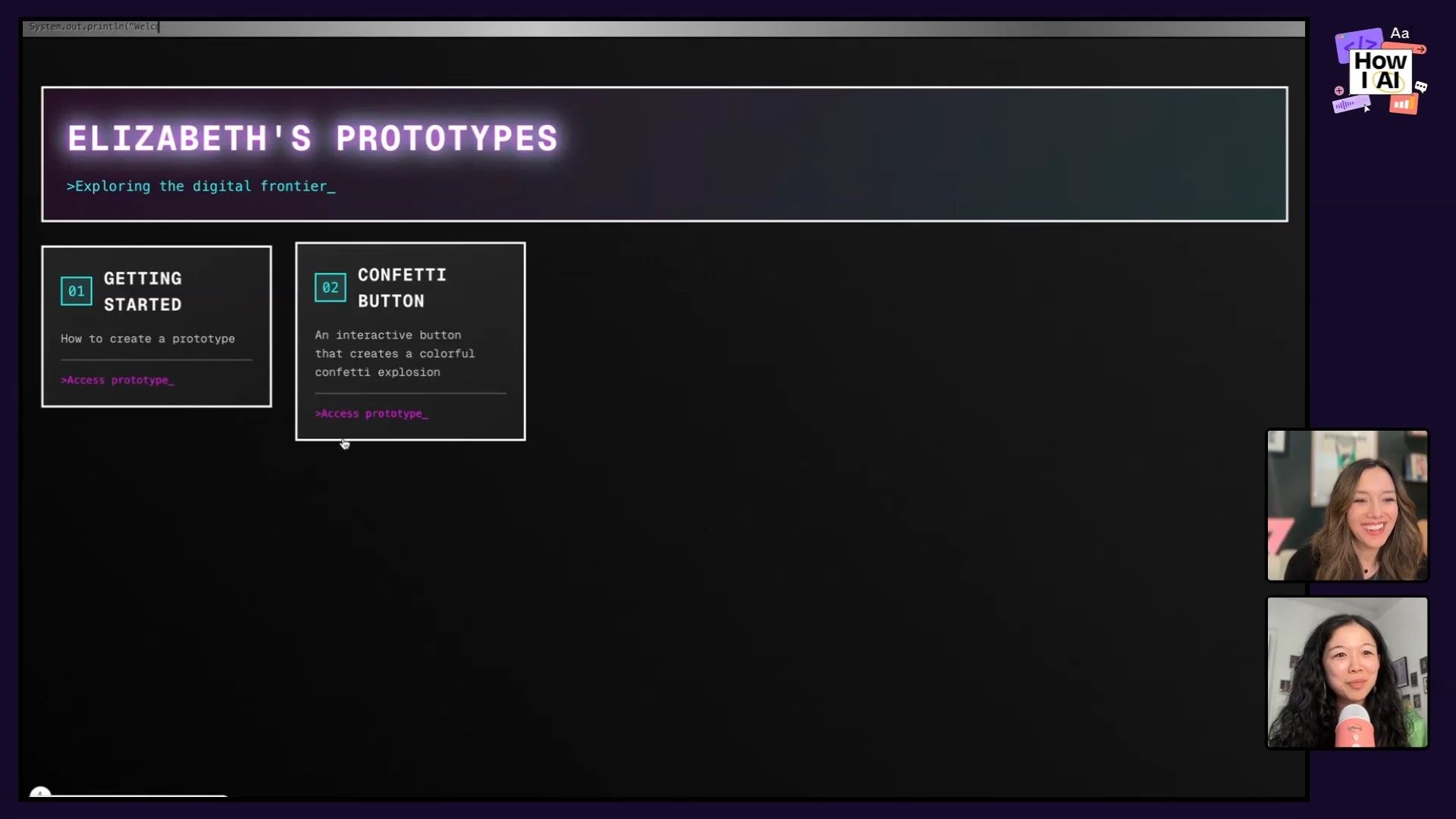
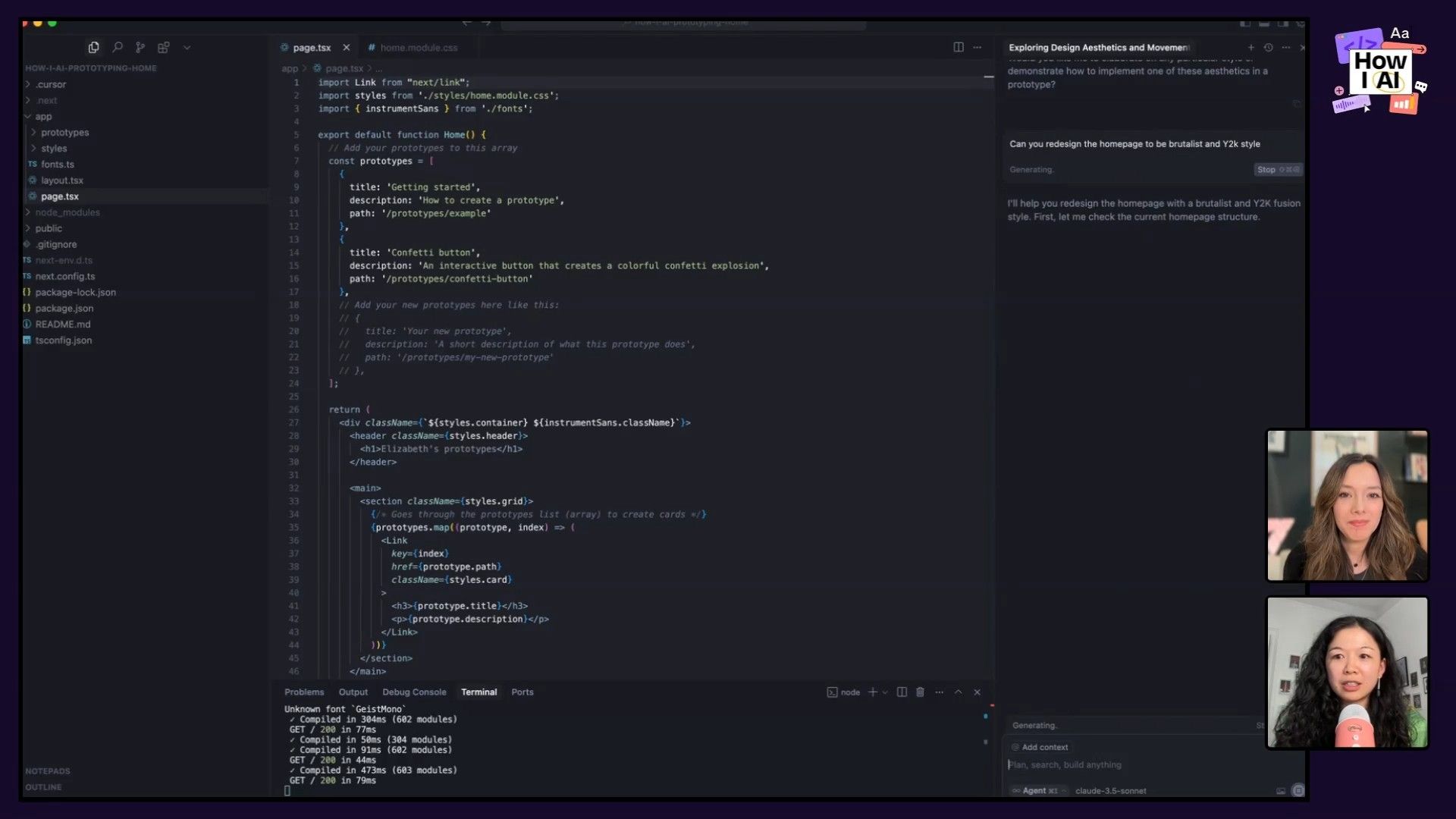
Instead of coming to the tool with a predefined style, Elizabeth starts by asking the AI for ideas. She treats it like a collaborative partner. She took a very bland, unstyled personal website and opened Cursor's chat to kick things off.
Her first prompt is a great example of this conversational approach:
What design, aesthetics and movements are you comfortable implementing lists of styles and describe them to me.
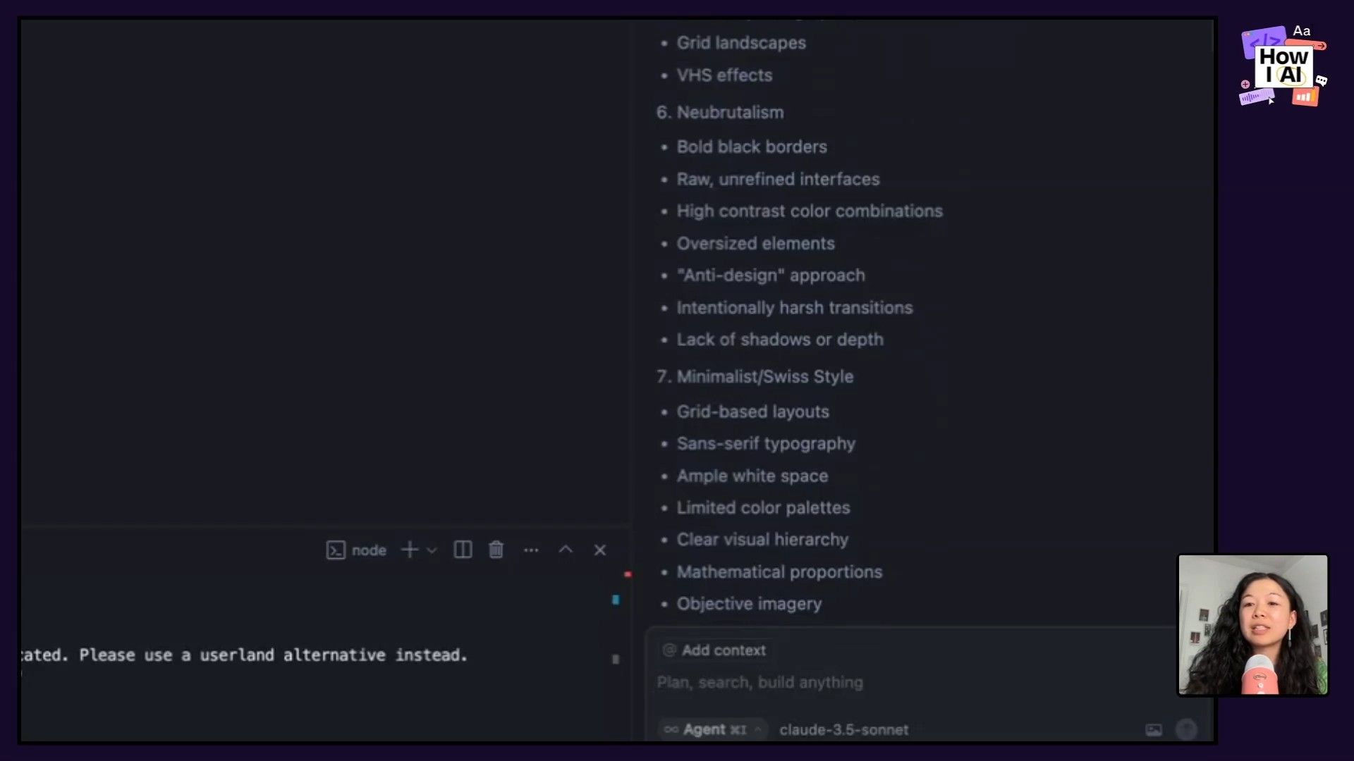
What I love about this is how Cursor provides descriptive keywords for each style it lists. For 'Cyberpunk,' it mentions "neon color schemes, dystopian elements, glitch effects." This gives you the language to have a more nuanced conversation with the AI in subsequent prompts.
Step 2: Combine Styles and Generate
To really test its creative range, I asked Elizabeth to combine two very different styles: Brutalist and Y2K. This is where the fun begins. She fed Cursor a simple follow-up prompt:
Can you redesign the homepage to be brutalist and Y 2K style?
The result was wonderfully chaotic and unexpected. It added a blinking command-line-style cursor, a typing effect in the header, and an extra-glossy hover effect on the links. It was a perfect throwback to the early 2000s web, something that would've taken me ages to code by hand back then.
Step 3: Iterate by Re-prompting with Checkpoints
What if you don't love the first result? Elizabeth's pro-tip is to liberally use the restore checkpoint feature to go back to the previous state. This prevents you from going too far down a rabbit hole you don't like. Then, amazingly, she ran the exact same prompt again.
Can you redesign the homepage to be brutalist and Y 2K style?
The second version was completely different—much more minimal, with a different layout and font treatment, but still capturing the requested aesthetic. This proves that you can use the same prompt as a creative lever, pulling it over and over to get unique variations until you land on something that sparks an idea.
Workflow 2: Building an Interactive Piano with Sound
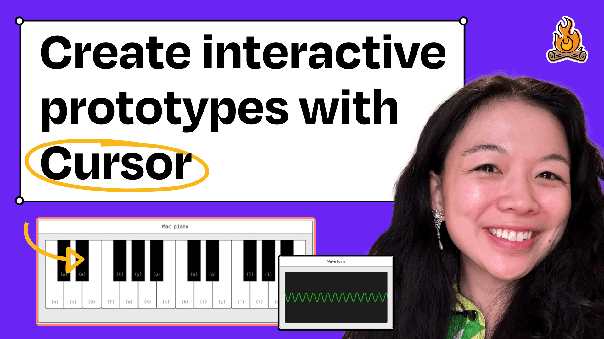
This next workflow is where you can really see the advantage of AI-powered prototyping over traditional tools like Figma. Elizabeth demonstrated how to build a complex, interactive prototype with sound—something that's notoriously difficult and time-consuming. Her example? A working digital piano.
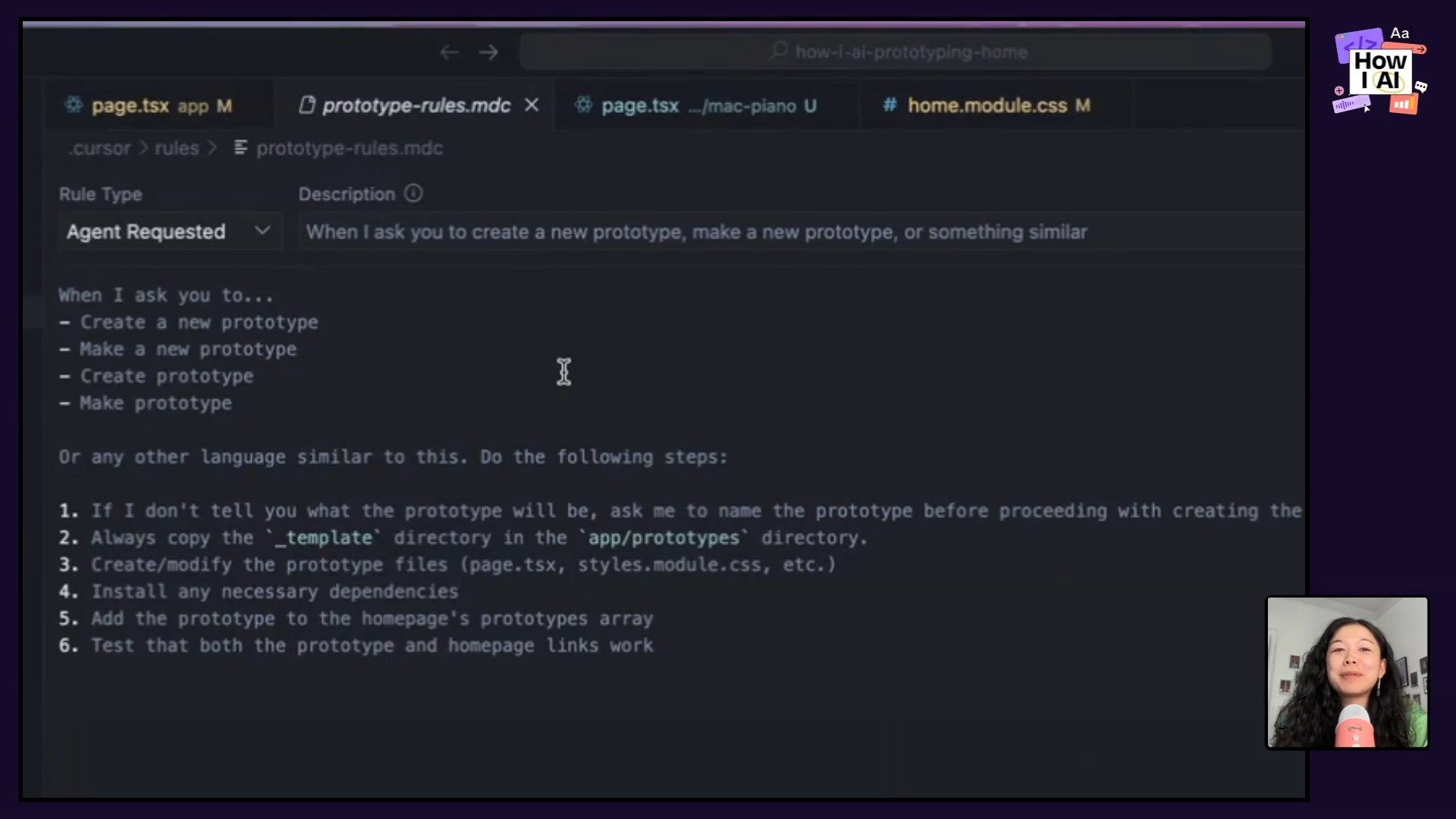
Step 1: Use a Cursor Rule to Automate Setup
Efficiency is key. To avoid repetitive setup tasks, Elizabeth uses a custom Cursor Rule. This is a simple instruction you give Cursor to automate actions. Her rule is wonderfully straightforward:
If I ask you to create a new prototype, copy this folder and then add it to my homepage.
This means whenever she wants to start a new project, she just asks, and Cursor handles creating the directory and files for her. It's a small thing that saves a ton of time and friction.
Step 2: Generate the Piano with a Single Prompt
With the setup automated, creating the piano itself was astonishingly simple. She started a new chat to ensure no context bleed-over from the previous project and used this prompt:
create a new prototype for a digital piano. in the style of Old Mac Os
In just a few moments, Cursor generated all the HTML, CSS, and JavaScript needed. The result was a functional piano, styled with a nostalgic Old Mac OS aesthetic, that played a cute piano sound when the keys were clicked. It just worked!
Step 3: Explore and Interact
This was a real, working prototype, not just a static image. We could click the keys and hear the notes. Elizabeth even mentioned that you could ask follow-up questions like, "What library are you using for sound?" or "How can I change the waveform?" to further customize it. This opens up a world of possibilities for adding sound design, branded audio cues, and moments of joy into applications—elements that are often neglected because they're too hard to prototype.
Workflow 3: Teaching an AI to Have 'Good Taste'
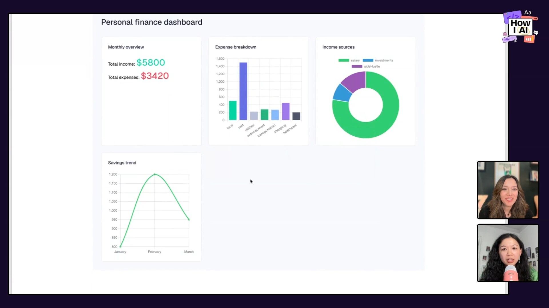
AI can be creative and build complex things. But can it have good taste? Elizabeth tackled this head-on by showing us how to refine a genuinely ugly, AI-generated personal finance dashboard into something clean, modern, and professional.
Step 1: Provide Clear, Specific Feedback and References
Starting with the ugly dashboard, Elizabeth's first prompt was a perfect example of how to give effective design feedback. She didn't just say "make it better." She was specific.
let's work on the finance dashboard... remove all the drop shadows. And then I'm gonna say, make the components look more modern. And then I'm also gonna ask it to... make it look like Robinhood Cash app or Stripe, et cetera.
She attacked the problem from three angles:
- Negative Feedback: Explicitly remove something she hates (
drop shadows). - Aesthetic Direction: Use a high-level descriptive word (
modern). - Positive Examples: Reference well-designed products in the same domain.
This immediately improved the design, removing the clutter and establishing a cleaner foundation.
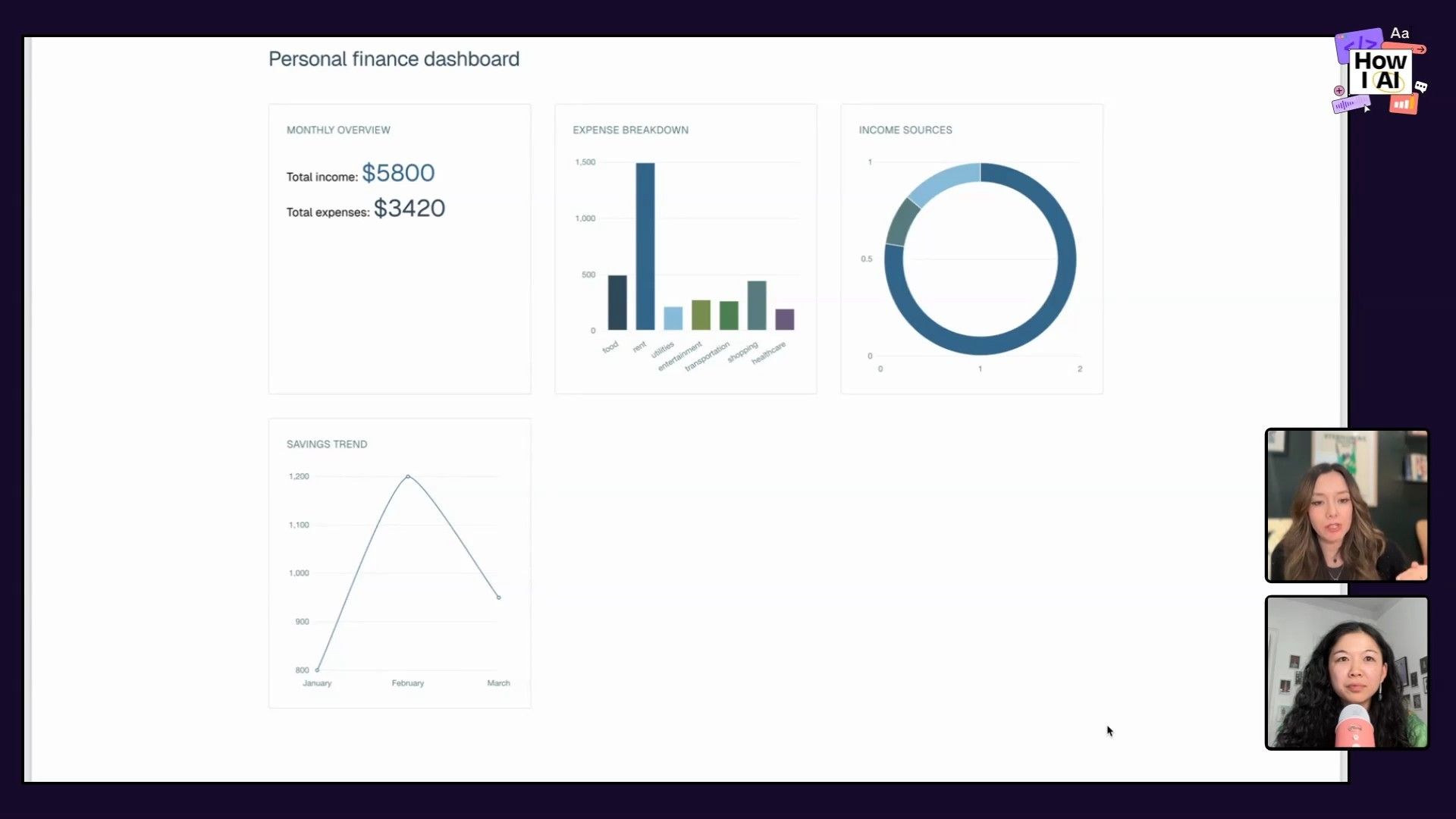
Step 2: Iterate with Design Principles
Next, to refine the data visualizations, she introduced established design theory. This is a really smart shortcut because the LLM is already trained on this information.
I kind of want it to simplify the colors a little bit on the page... and then I also want it to maybe be inspired by Edward Tuft's principles
By referencing a master of data visualization like Edward Tufte, she guided the AI toward a more muted, data-focused, and legible design without having to spell out every single principle herself.
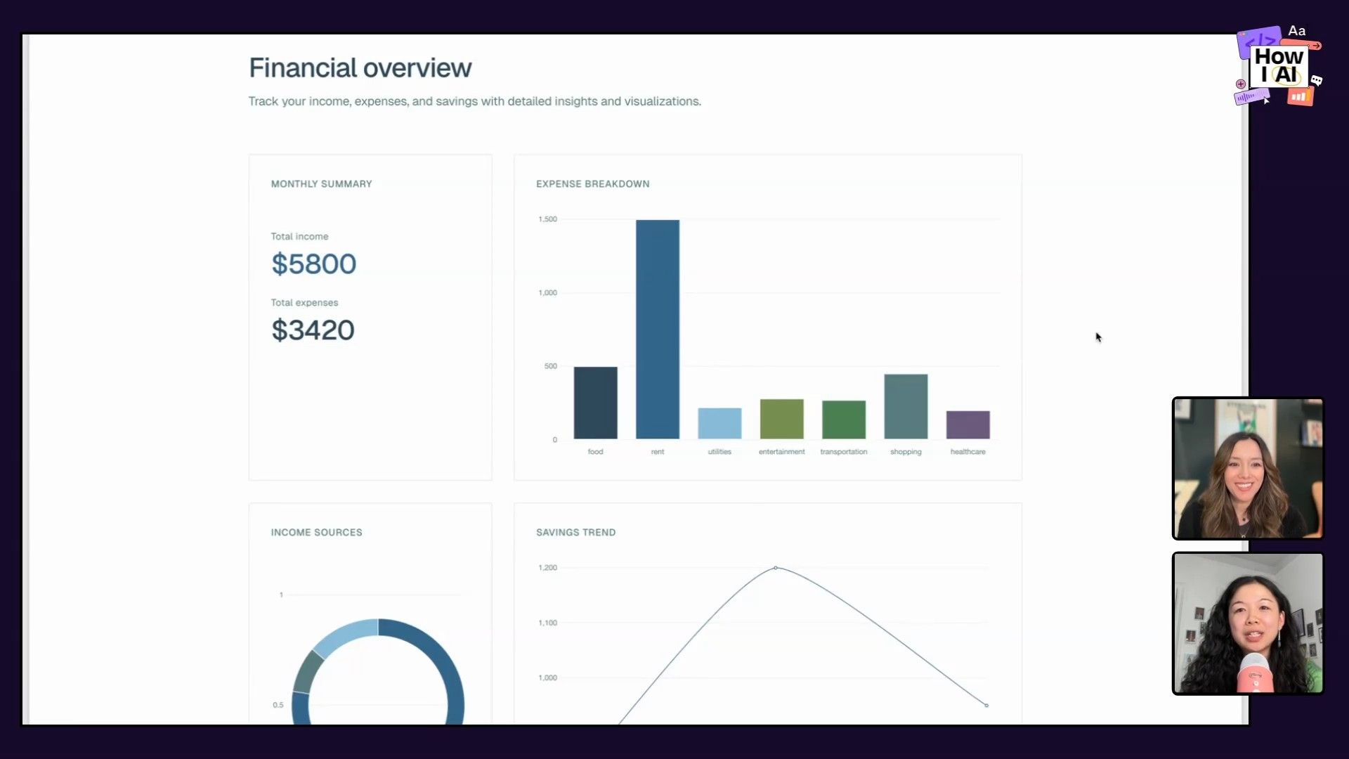
Step 3: Use a Psychological Hack for Layout
For the final layout problem, Elizabeth used what I'd call a psychological hack—a prompt that appeals to a standard of quality.
can you improve the layout to make it look like something a top designer Apple would approve
This prompt works so well because it taps into the vast knowledge base about Apple's design philosophy—grid systems, spacing, and clean organization. The AI immediately reorganized the dashboard components into a proper grid, making it look far more intentional and professional.
Conclusion: Your New Creative Partner
Across these three workflows, a clear theme emerges: AI tools like Cursor are becoming less like simple code assistants and more like true creative partners for designers. We saw how to use it for brainstorming visual styles, building complex interactive prototypes with sound in minutes, and iteratively refining a design by teaching the AI what 'good taste' looks like.
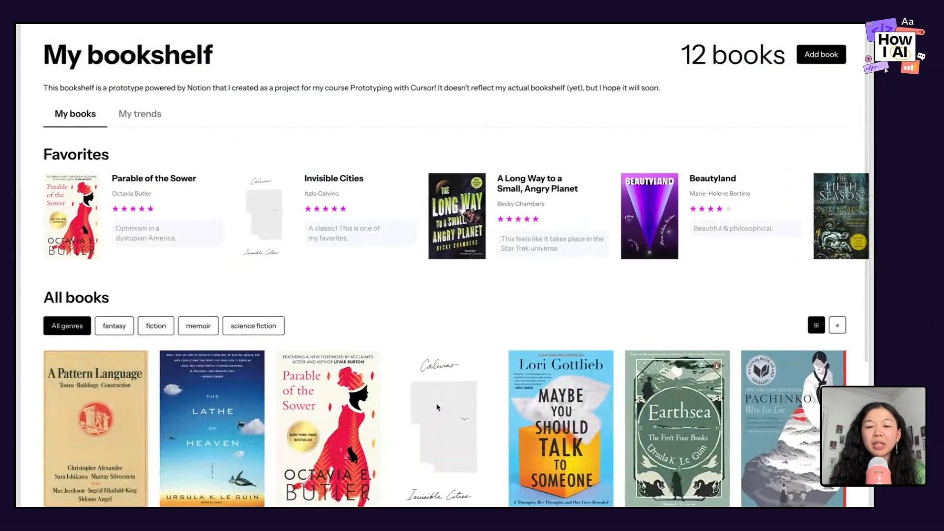
Elizabeth also gave us a glimpse of what's next by showing a personal project: a beautiful bookshelf app powered by a Notion database. Being able to prototype with real data is a huge deal, allowing designers to create much more realistic and useful prototypes. Her dream is to build her own version of Goodreads, and with these tools, that feels more achievable than ever.
My biggest takeaway is that designers shouldn't be afraid to get their hands dirty with these tools. You don't need a deep coding background to start. By having conversations, providing great references, and being willing to experiment, you can unlock a new level of creativity and efficiency in your work. Go ahead, open up Cursor, and see what you can create!
Thanks to Our Sponsors
A huge thank you to our sponsors who make this show possible:
- Lovable: Build apps by simply chatting with AI
- Retool: AI that's designed for developers, and built for the enterprise
Episode Links
Try These Workflows
Step-by-step guides extracted from this episode.

How to Iteratively Refine an AI-Generated UI Using Design Principles in Cursor
Transform an ugly, AI-generated UI into a polished, professional design by providing specific feedback to Cursor. This workflow teaches you how to guide the AI using negative feedback, aesthetic direction, real-world examples, and established design theory.

How to Build an Interactive Piano Prototype with Sound Using Cursor
Learn to rapidly prototype complex, interactive components with sound using a single prompt in Cursor. This workflow demonstrates how to automate project setup and generate a fully functional digital piano in moments.

How to Brainstorm Web Design Aesthetics Using Cursor AI
Use Cursor's chat feature to explore and combine diverse visual styles like Brutalism and Y2K. This workflow shows how to generate unique design variations for a webpage by having a creative conversation with AI.


