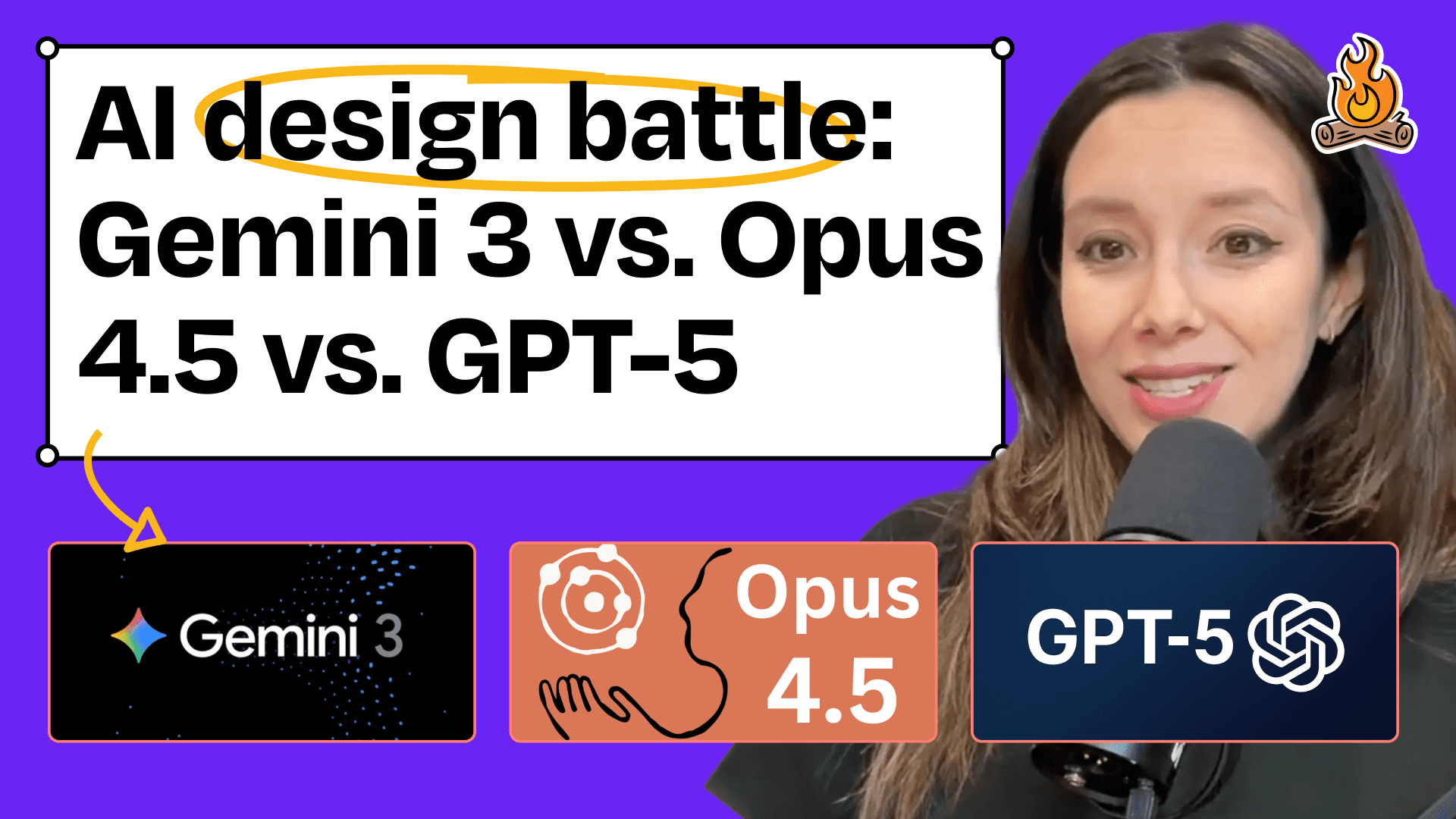
AI Design Battle: Gemini 3 vs. Opus 4.5 vs. Codex 5.1—Which Model Is the Best Web Designer?
I put Google's Gemini 3, Anthropic's Opus 4.5, and OpenAI's Codex 5.1 in a head-to-head battle to redesign my blog, testing their visual, UX, and SEO skills. Discover which model came out on top and how their different approaches can shape your own AI workflows.
Claire Vo
The last few weeks have been a blur of new coding models hitting the market. We keep hearing they’re fast and that they’re crushing all the benchmarks, but what really caught my eye was the talk about their design skills. My social media feeds are full of amazing landing pages and UI components, all apparently generated in one go.
But how do they hold up on a real-world task? It’s one thing to generate something beautiful from a perfect prompt; it’s another thing entirely to take an existing page that’s a little… lackluster… and actually make it better. Which of these new models can really act like a trusted design partner? Who can you give a project to and just say, "This isn't great, can you fix it?"
For this special mini-episode, I decided to find out. I took my own ChatPRD blog—a page that I’ll be the first to admit needs some love—and put three of the newest models to the test: Google's Gemini 3 Pro, Anthropic’s Opus 4.5, and OpenAI’s Codex 5.1. I gave them the exact same prompt and input code to see which one is really the best designer in a one-shot redesign challenge.
The Great AI Design-Off: The Setup
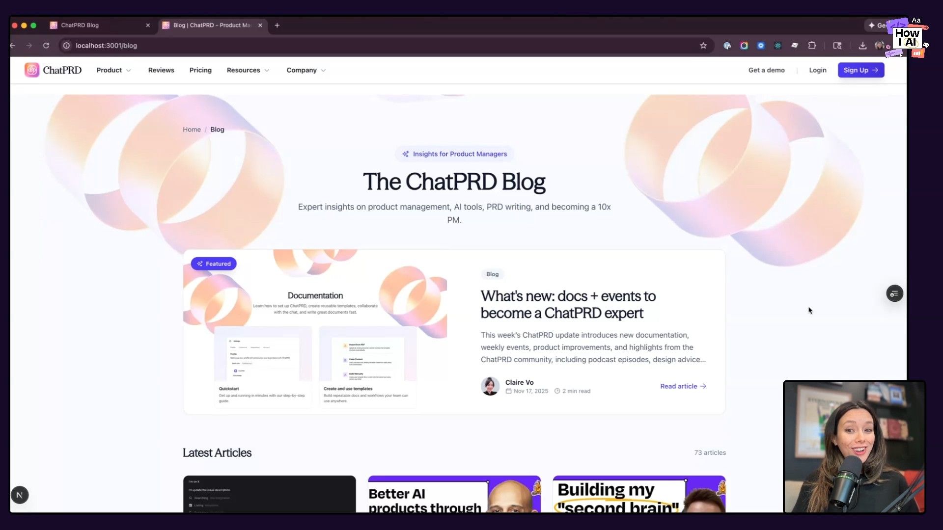
The testing ground for our competition was the ChatPRD blog. It does its job, but I've always felt it was missing some visual polish and could be a lot more user-friendly. It seemed like the perfect candidate for an AI-powered redesign.
I used Cursor for this experiment. It's an AI-first code editor that makes it easy to switch between different models, which meant I could keep the environment consistent and give each model the exact same context and code directory.
The Universal Prompt
To keep things fair, I wrote one straightforward prompt to use for all three models. I tried to phrase it like a normal request I’d make to a human colleague, focusing on what I wanted to achieve rather than giving it a list of instructions.
Here’s the exact prompt I used:
Redesign the blog page to improve both the visual appeal and user experience. Add best practices for SEO and navigation.
With the stage set, I sent this prompt to each of our three contenders. Here's a breakdown of how they did.
Round 1: Gemini 3 Pro - The Reputable Designer
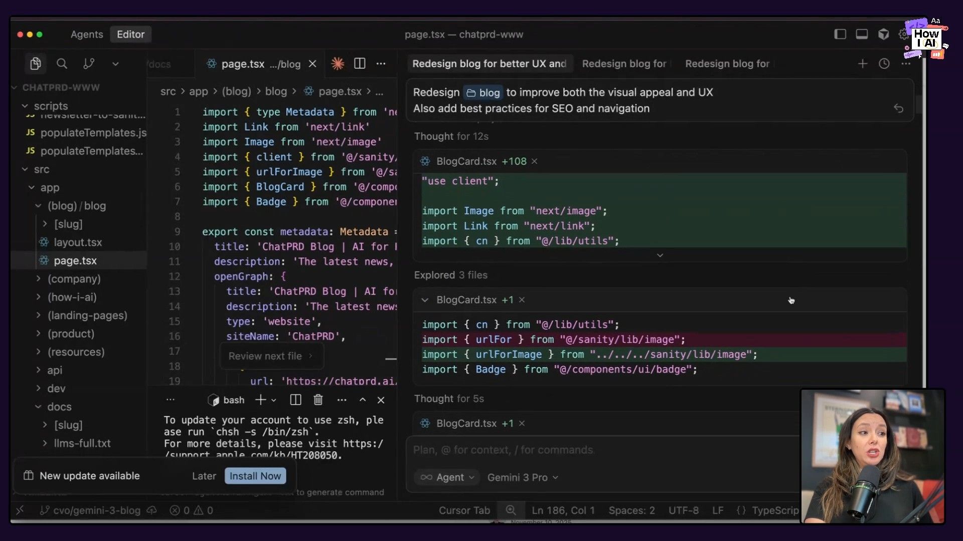
First up was Gemini 3 Pro. I started with it because I've heard so much about its design skills. When I ran the prompt, Gemini paused for a moment, laid out its 'Chain of Thought' reasoning about visual design, UX, and SEO, and then got straight to writing the code.
The Result
The result was a big improvement. It was fast, and the design it produced was definitely usable.
- Hero Section: It created a nice hero image featuring the most recent blog post, immediately giving the page a focal point.
- Card Layout: Below the hero, it arranged the rest of the posts into a clean, three-column card layout.
- Interactive Elements: The cards featured a pleasant hover effect that zoomed in on the images, and it added tags and publication dates for better context.
It wasn't perfect, though. It added a tag at the very top of the page that was crammed right up against the main navigation, which suggests it didn't have the full visual context of the page. It also didn't know what to do with blog posts that were missing a featured image. Even with its reputation, it wasn't my favorite of the three.
From an SEO perspective, Gemini 3 Pro did a solid job, implementing:
- JSON-LD Schema: It added structured data using JSON-LD, which is fantastic for search engine comprehension.
- Breadcrumbs: A great addition for navigation and SEO.
- Semantic HTML: Improved the underlying structure of the page.
- Metadata: Added relevant meta tags for better indexing.
Verdict: A solid, fast, and functional redesign. A great starting point, but it lacked the final polish.
Round 2: Anthropic's Opus 4.5 - The Meticulous Planner
Next, I ran the exact same prompt with Anthropic’s Opus 4.5. The difference in its approach was immediate and obvious. Instead of jumping straight into the code, Opus 4.5 used a tool within Cursor to create a to-do list. It actually laid out a step-by-step plan before writing anything.
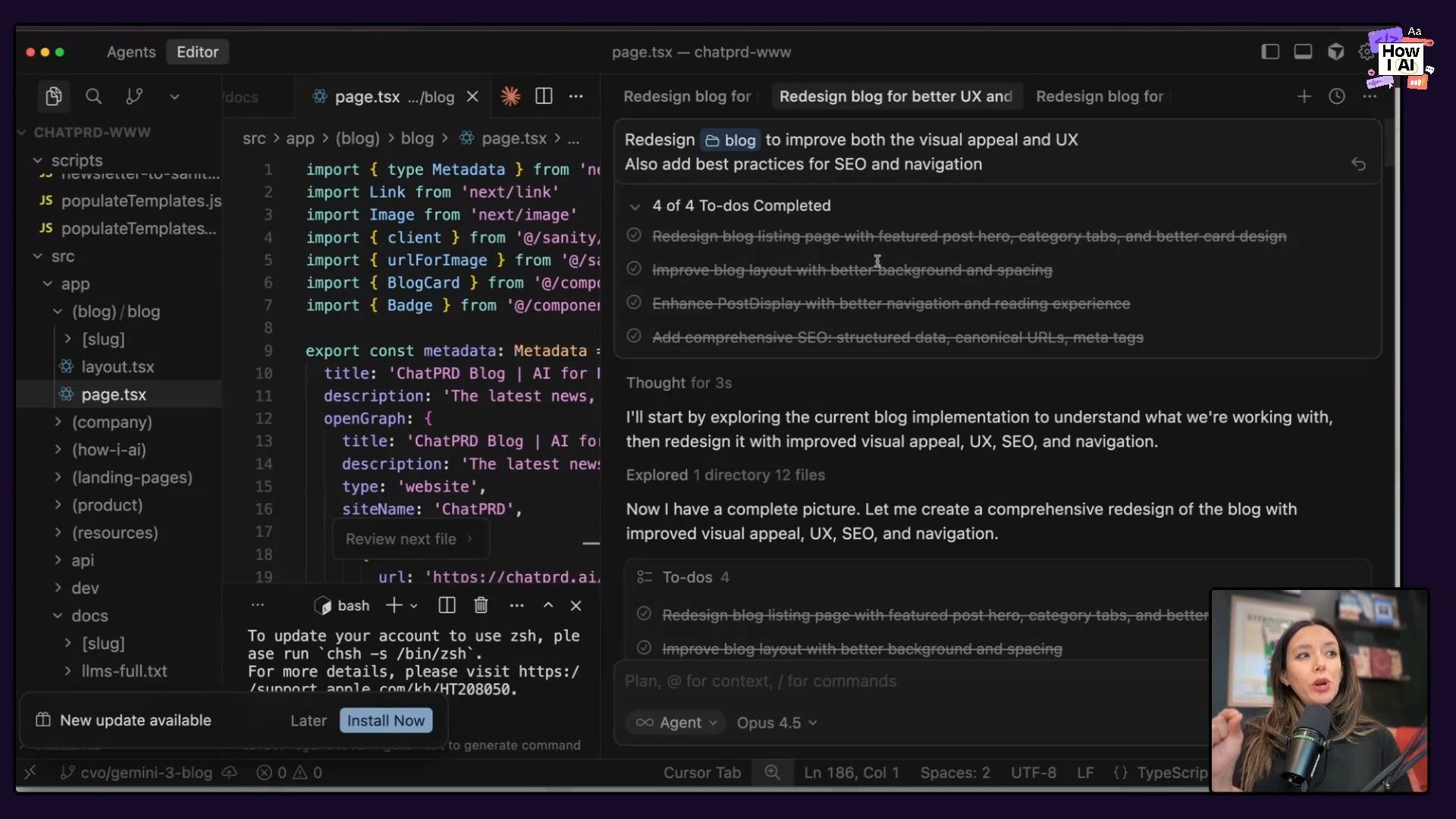
Its plan included four clear steps:
- Redesign the blog listing page.
- Improve the blog layout.
- Enhance the post display.
- Add comprehensive SEO (structured data, canonical URLs, meta tags).
That planning phase seemed to be the key. Its ability to break down the problem and outline a strategy led to a much better result.
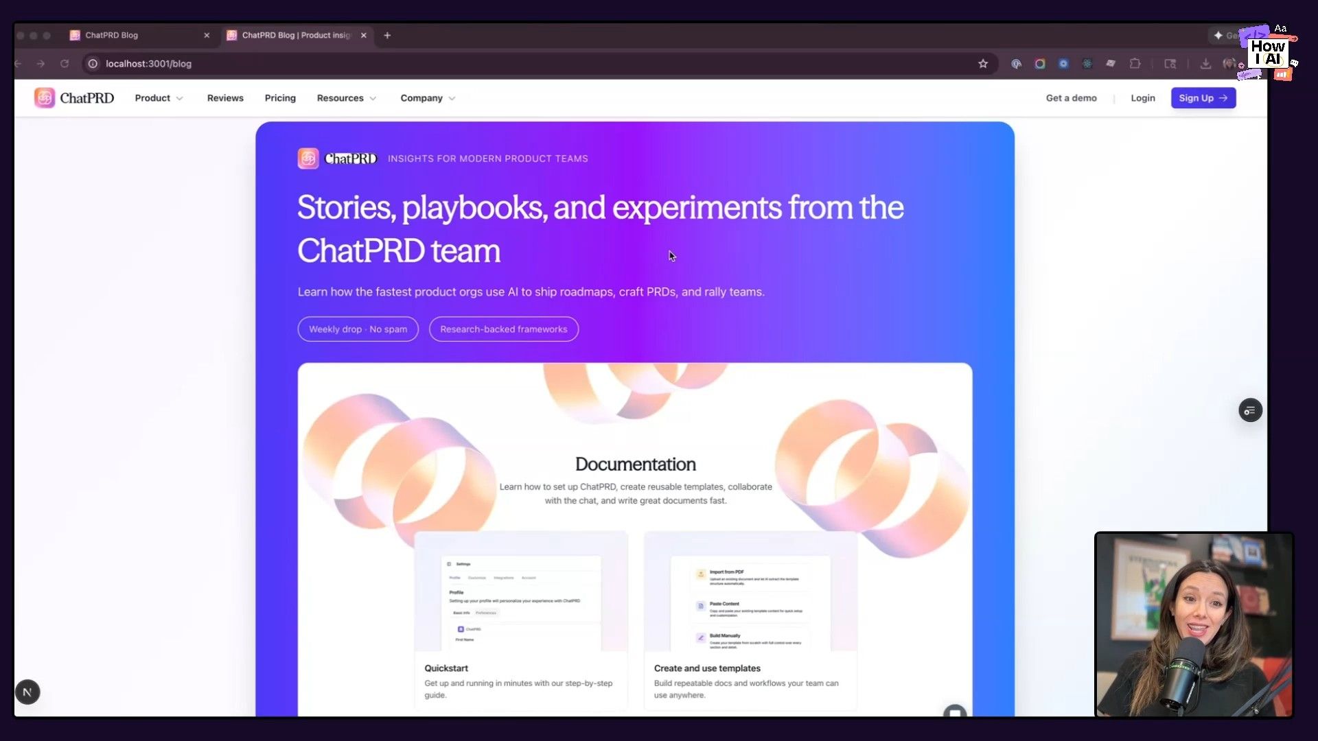
The Result
Spoiler alert: Opus 4.5 was fantastic. It created the best-looking and most functional page of the three.
- Context-Aware Design: It scanned my repository for existing design assets and incorporated them into the new design. It pulled in background images with our signature 'rings' design element, making the page feel instantly on-brand, unlike Gemini's simple gradient.
- Polished UI/UX: While the layout was conceptually similar (featured article + cards), the execution was far more refined. When hovering over a card, not only did the image zoom, but a cute little arrow icon appeared as a call-to-action. It’s those small, thoughtful touches that take a design from good to great.
- Graceful Fallbacks: For blog posts without a featured image, Opus 4.5 created a placeholder with a nice book icon. This kept the layout consistent and visually appealing, a problem Gemini didn't solve.
- Functional Enhancements: It added an estimated reading time to each post card, a small but significant UX improvement.
It even went the extra mile and redesigned the newsletter signup form at the bottom of the blog posts, creating a really nice component (even if it did use a little of that typical AI purple!).
Verdict: The clear winner. Its ability to plan resulted in a thoughtful, polished, and production-ready design that felt deeply integrated with our existing brand.
Round 3: OpenAI's Codex 5.1 - The Backend Specialist?
Finally, it was OpenAI’s Codex 5.1's turn. It also created a to-do list like Opus, but the plan was much more generic and less detailed. This lack of planning was a preview of what was to come.
The Result
Honestly, the result was disappointing. The design wasn't just unpleasant to look at, it was also broken.
- Generic Design: Right away, it produced that dreaded purple gradient that just screams 'AI-generated.' It's a look we've all seen a million times, and it had nothing to do with my site's branding.
- Poor Asset Choice: It selected a version of my logo with a white background that looked terrible on the colored gradient.
- Broken Functionality: It tried to create a featured post layout, but the main image was just a static picture—it didn't link anywhere. It added category links that didn't seem to work, and the main blog list didn't even show any of my existing posts.
On the SEO front, it did add metadata and an embedded Schema.org block, so it gets points for that. However, the poor visual design and broken user experience made the page unusable.
Verdict: Not the right tool for this job. While I've had great success with GPT models for backend and functional work, this experiment showed that front-end design is not its strong suit.
The Final Verdict: And the Best AI Designer Is...
After this head-to-head test, the winner is obvious: Anthropic’s Opus 4.5 is the best AI designer of the three.
It didn't just win on looks; it won because of its process. The model's ability to create a detailed plan before it started coding directly led to a higher quality result. It gave me a design that was polished and good-looking, but also thoughtful, aware of my existing brand, and completely functional.
This experiment really underscores an important lesson for anyone building with AI: not all models are the same. I’m a big believer in model switching. You wouldn’t use a hammer for a screw, and you shouldn’t use just one AI for every single task. From now on, Opus 4.5 is my go-to for front-end design. Gemini 3 Pro is a solid, fast choice for general tasks. And I'll keep Codex 5.1 in my toolbox for backend coding.
What's amazing is that in less than 20 minutes, I had three different design options, all with major SEO and UX improvements. This would have taken me days or even weeks with a normal workflow. I was so happy with the Opus 4.5 design that I’m actually going to use it! You can see it live on the ChatPRD blog right now.
Getting a feel for which model to use for which task is becoming a really important skill. I’d encourage you to run your own tests, see what you get, and start building your own mental map of what each model is good at. This is how we build things now—with a whole team of specialized AI assistants at our disposal.
***
Brought to you by
- **Lovable**—Build apps by simply chatting with AI
***
Episode Links
Try These Workflows
Step-by-step guides extracted from this episode.


